<< click here to read an overexplanation about this art >>
Metalheart is my most recent exploration in digital design
This art style is inspired by the early(ish) age of digital art in the late 90s and early 00s. Back then, this genre of digital art was called "Metalheart" or sometimes "Depthcore". The former name was popularized by Swedish designers who, in 1998, created and sent assets (fonts, shapes, etc.) to creators around the world via the EMBOXX CD. Creators sent works back to the designers and their work was later published. However, the look and feel of this art style never truly caught on, and remains on the outskirts of the internet for nerds like me to enjoy.
The Creation Process
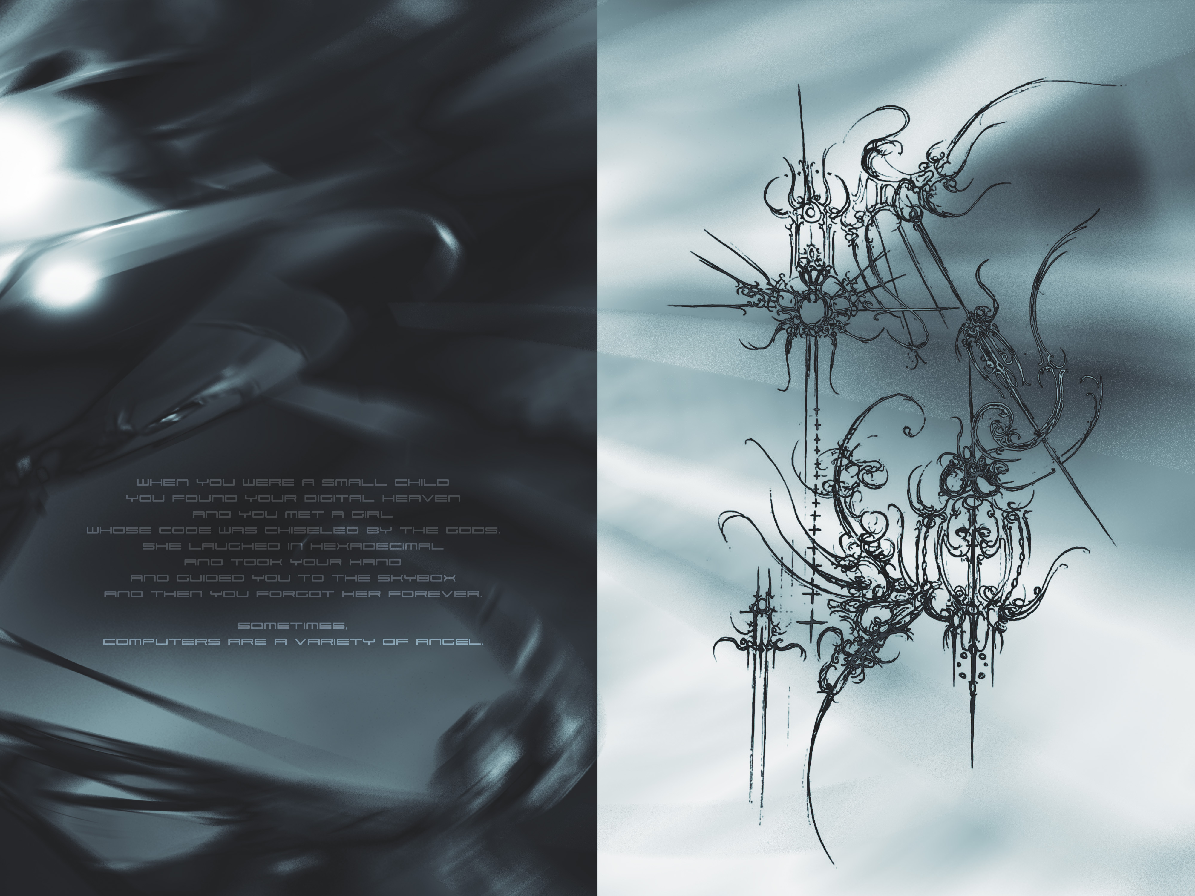
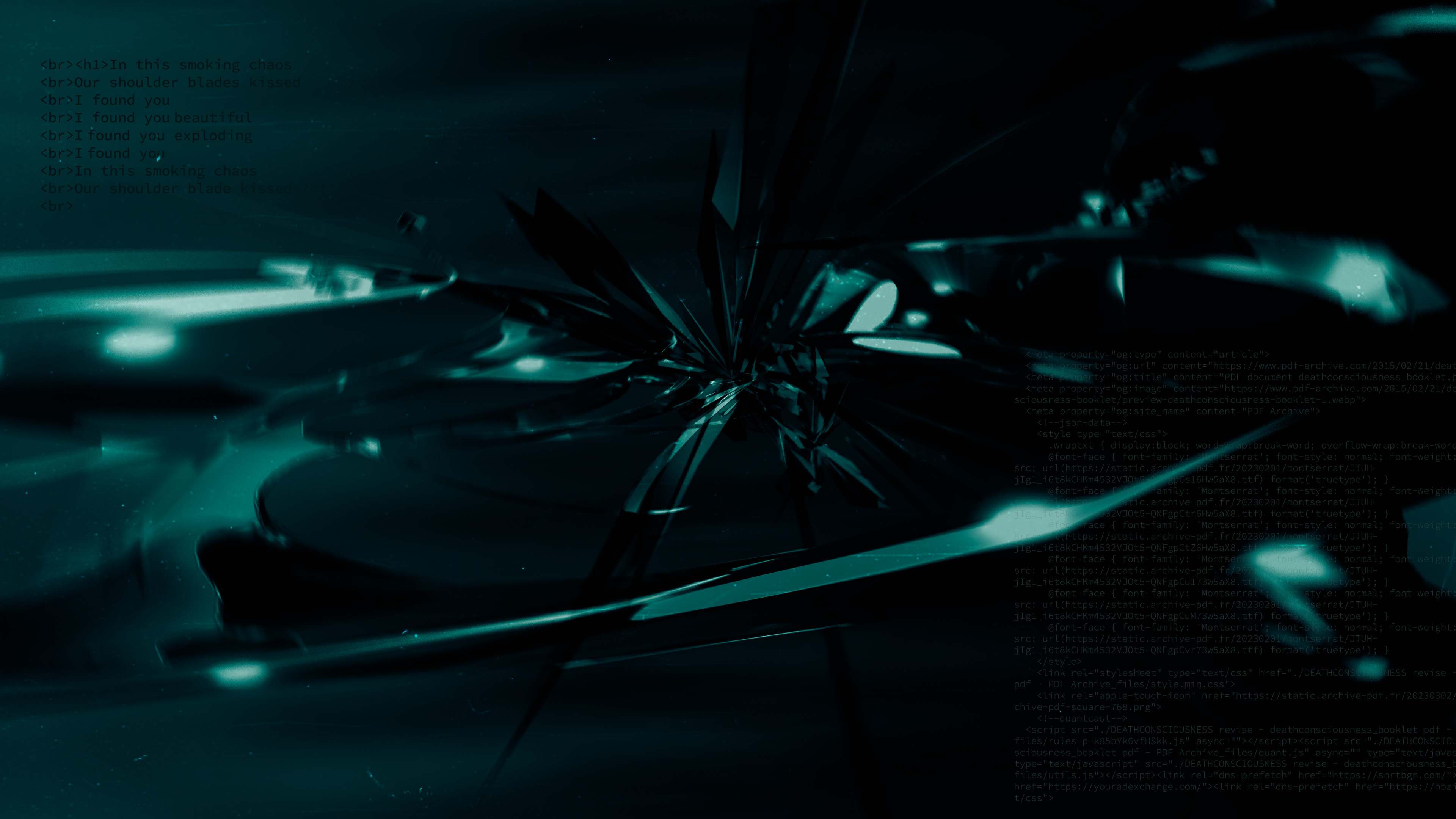
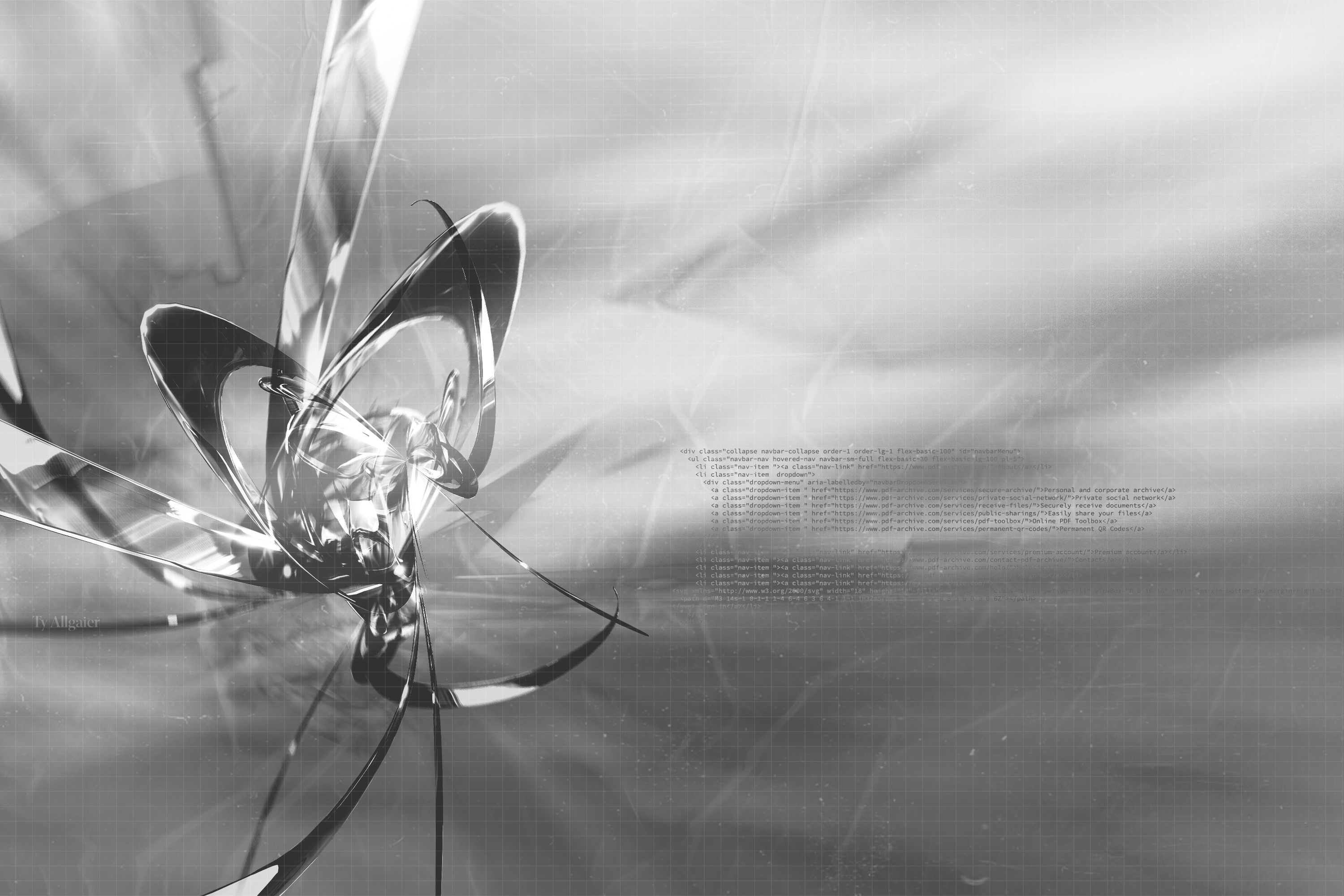
These designs are composed of various layers, all of which are distorted in more than one way. The main layers comprising my take on Metalheart are as follows: a textured background, a few layers of abstract metallic shapes, a grid, text, and a textured overlay. Each work has its own variation of these layers. Some may have fewer layers, some may have more. Each layer is customized and distorted until I feel it has visual harmony. More recently, I've been experimenting with written text rather than digital, mostly because I find the contrast of handwritten text and digital imagery quite fun.
Why??
When I was younger, I enjoyed spending time exploring the web and discovering corners of the internet that not many people saw. The internet was a place where anyone could customize their own webpage, or publish their art for anyone to see. I found it inspiring and authentic. Now, as an adult, I still enjoy doing this, although I find it somewhat more difficult with the current state of the corporate-dominated internet. When I first stumbled upon this art style while exploring the internet, it resonated with me for a couple of reasons:
As a designer, the complex layers, overlays, and textures of Metalheart really scratch an itch. In this age of digital minimalism when every part of the internet looks the same and oversimplified, Metalheart offers a breath of fresh air. It's a rejection of minimalist imagery, and an exploration in complexity and visual nuance.
I was born in the early 2000s, around the same time that this design trend was really "popping off." When I was young, designers were willing to take more risks visually, and some early softwares implemented visuals akin to Metalheart (Frutiger Aero, a similar but softer look, was more popular. Think first-gen Wii aesthetics). I have a lot of nostalgia for this era of digital design when software was more expressive and customizable. Although, there is also something to be said about the accessibility of simplified UX/UI and the benefits of designing with accessibility in mind (my beef is more about the visual aspect of minimalism. That every company now has the same design language, and zero personality in terms of branding).
Most of my free (and not so free) time is spent listening to music. I spend a lot of time listening to music because I like hearing sounds I've never heard before. The most extreme example of this is the genre “Breakcore.” Breakcore features drum samples called “breaks” and these artists loop, cut and distort these breaks to create a new song. The tempo is usually fast-paced and the overall vibe is chopped, distorted, and complex. It’s probably the most “chronically online” music you can listen to, and this genre captures the same feeling in audio that Metalheart does visually. I often listen to Breakcore as I'm making these designs, and find the music extremely inspiring.
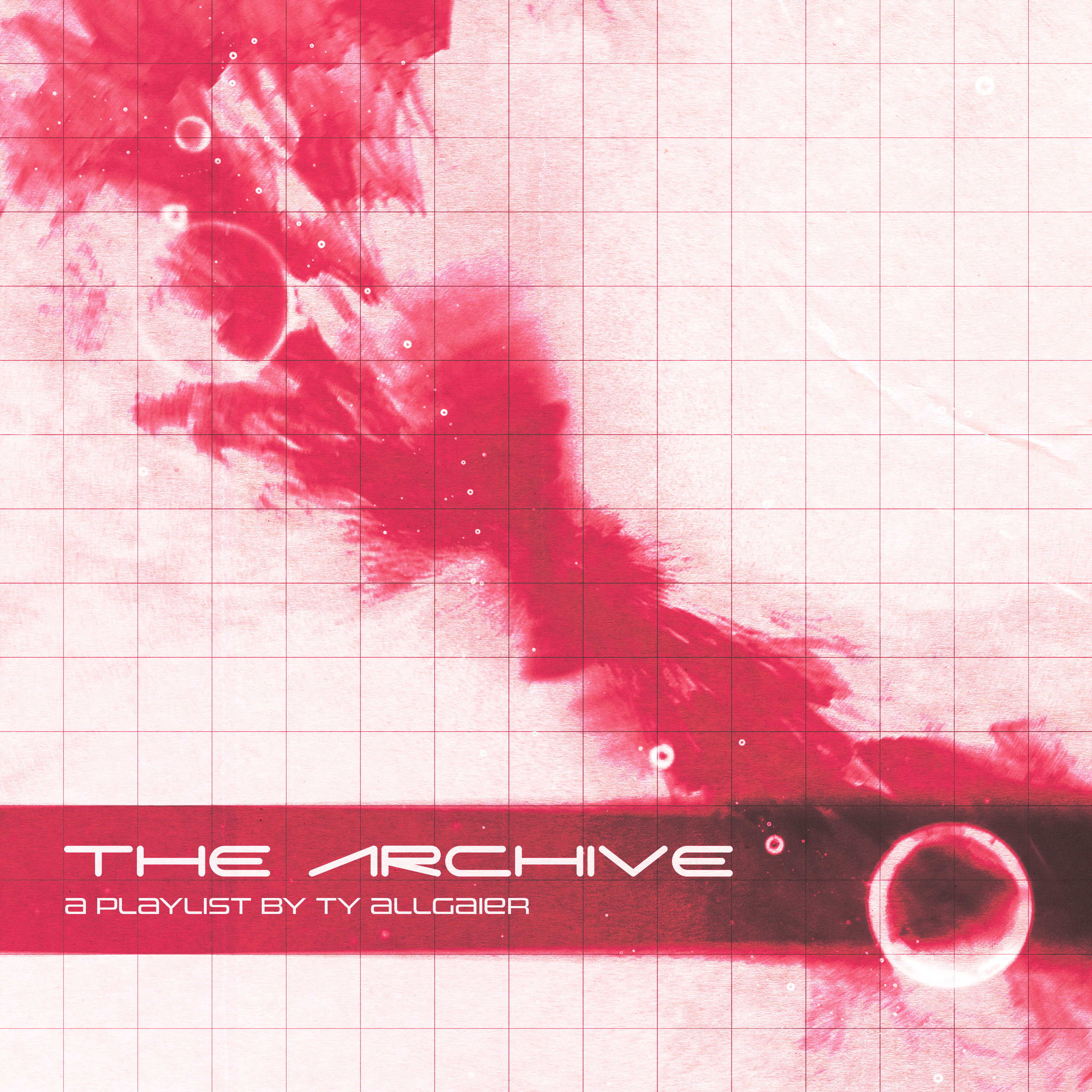
<< click here to listen to my Breakcore playlist >>
Hope you enjoy my art. Thanks for reading!

"Sometimes, Computers Are a Variety of Angel."
when you were a small child, you found your digital heaven and you met a girl whose code was chiseled by the gods. she laughed in hexadecimal and took your hand and guided you to the skybox, and then you forgot her forever. sometimes, computers are a variety of angel.


